
Rapid Website Redesign Boosting CPA Firm Credibility
Modern website design completed in 48 hours, optimized for client inquiries. 💼
Client
Servello CPA
(Westborough, MA)
Services
Custom Systems
Industry
Finance
Launched
June 2026
The challenge
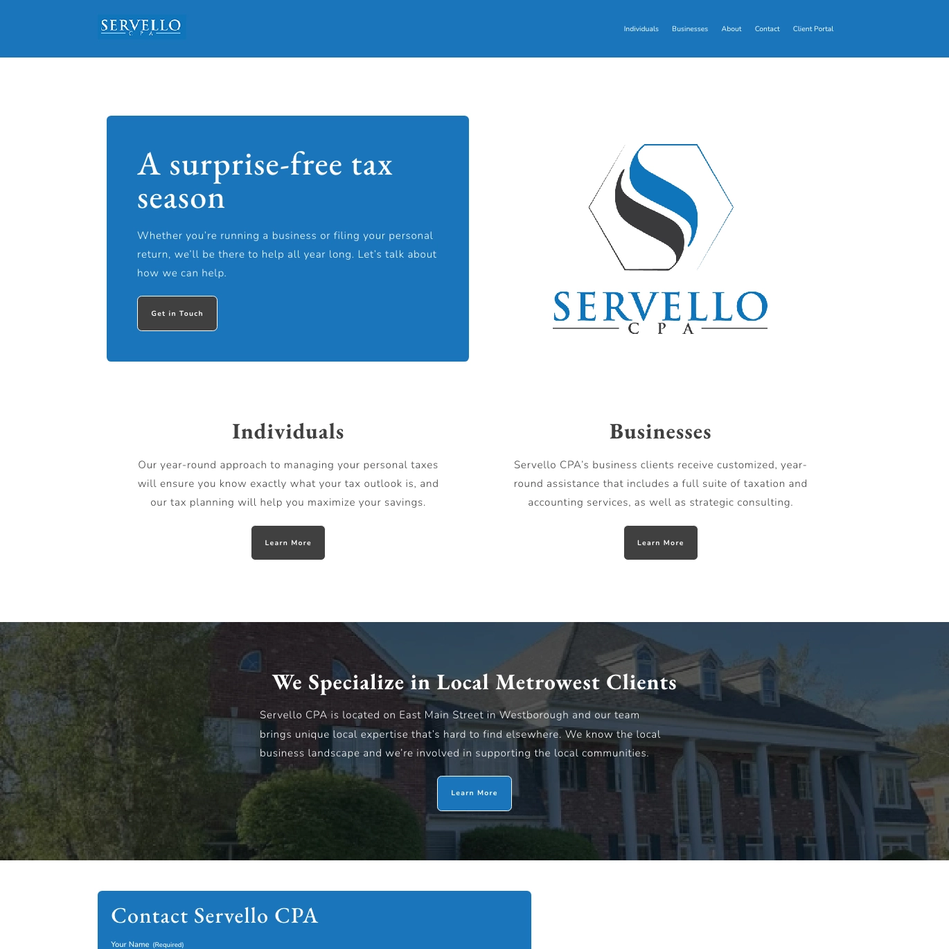
Outdated website design hurt credibility and mobile traffic for a growing CPA practice.
Vinnie’s practice had outgrown its free website builder platform. For a prestigious firm managing client finances and tax strategy, the site’s appearance didn’t match the caliber of work being delivered—it looked like a DIY project rather than a firm you’d trust with your tax planning. The mobile experience was painful: pages didn’t render properly on phones, forms were tiny and hard to interact with, and visitors trying to reach the firm from mobile devices often bounced before completing an inquiry.
Beyond aesthetics, the site lacked basic SEO structure. Internal linking between service pages was nonexistent, meaning a visitor learning about tax returns couldn’t easily discover related services like bookkeeping or payroll processing. The form submission experience was equally problematic—inquiries weren’t being captured consistently, and there was no mechanism to qualify leads before routing them to the right team member. The site was doing the bare minimum and costing the firm business.
The real issue wasn’t complexity; it was that a free platform had served its purpose but was now a liability. A redesign needed to happen fast—Vinnie was ready for a fresh start, and the window to capitalize on his growth was narrow.
“Sometimes speed is the feature. We modernized their presence in two days—cleaner design, mobile-first, better conversion flows. They were happy with the results and back to growing the practice.”
— Rob Petrin
A Very Speedy Developer
The Build
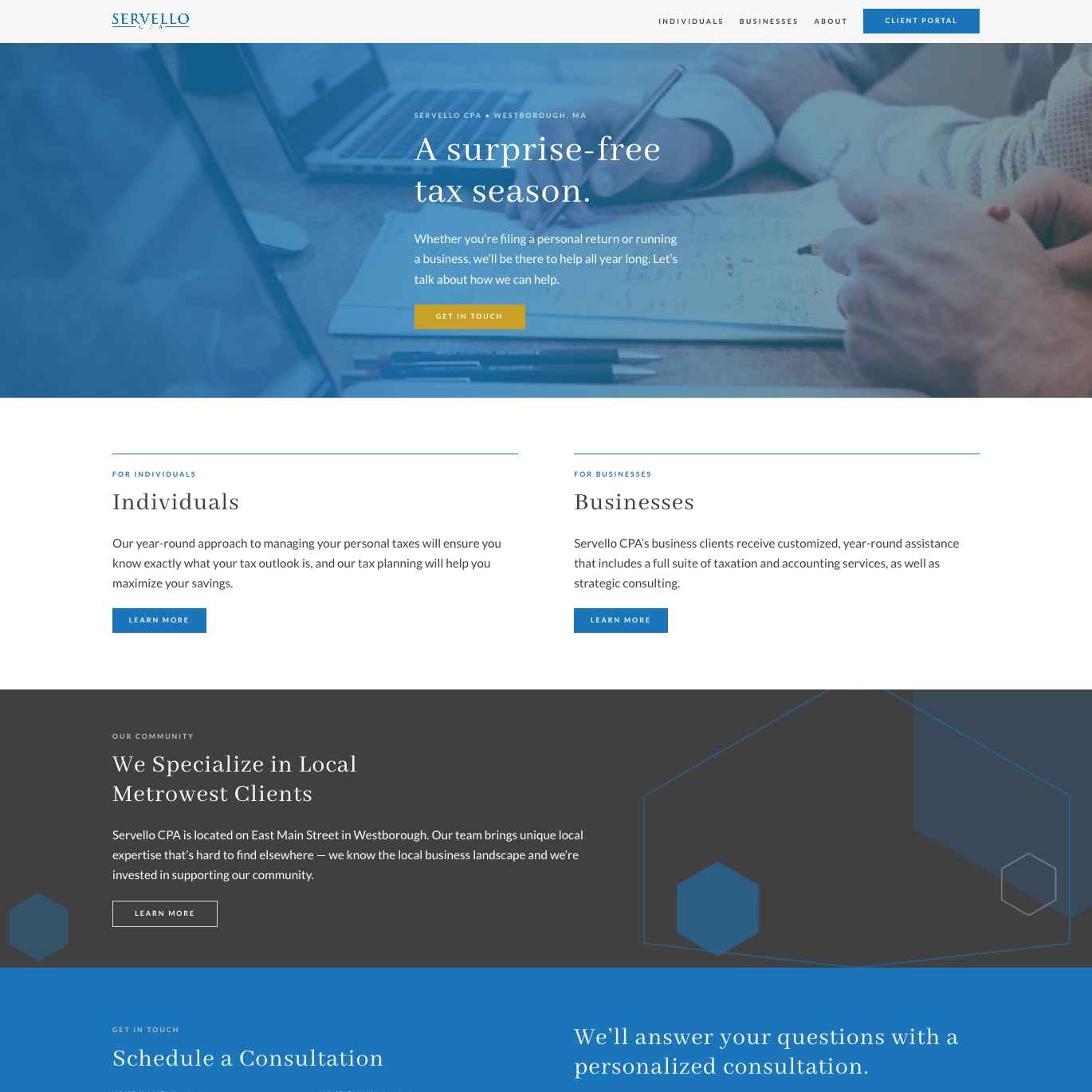
Rapid aesthetic overhaul with mobile-first responsive design to increase lead inquiry conversions.
The rebuild started with WordPress and the Gutenberg block editor, giving Vinnie control over his site without requiring code knowledge. Every page was restructured with modern CSS conventions—primarily CSS Grid for responsive layouts that adapt seamlessly from mobile to desktop, eliminating the awkward scaling issues of the old site. The redesign prioritized the critical path: a prominent hero section on the homepage with a clear CTA, easy-to-scan service descriptions, and strategic internal linking between related services (e.g., tax returns → bookkeeping, payroll → compliance).
Gravity Forms replaced the broken form situation entirely. A single intake form now captures essential information (name, phone, service needed, business type) and routes inquiries automatically to the appropriate team member based on service selection. The form integrates with their existing workflows, reducing manual triage work and ensuring faster response times.
The mobile-first approach wasn’t an afterthought—every component was designed for thumb-friendly interaction on a phone first, then enhanced for larger screens. Load times were optimized, and the overall design conveyed professionalism through clean typography, proper spacing, and strategic use of color. The site launched within the 48-hour window Vinnie needed, and the credibility lift was immediate—inquiries increased and clients felt more confident in the firm’s professionalism.
Stack
What we used.
- WordPress
- ACF Pro
- WP Engine
- Vanilla JS